Hover App: Onboarding
Project Overview:
Hover (hover.to) is mobile application that creates customizable three dimensional renderings of single family homes from user-captured smartphone photos. Marketed to residential contractors, insurance estimators, and homeowners, Hover allows its users to quickly and easily measure a home’s exterior dimensions and share customization options without ever having to use a tape measure, saving its users time and money.
Duration: 8 Weeks
Platforms: iOS, Android, Web
If you want to get right to it and skip my summary, follow THIS LINK to the client presentation and play with the final prototype below.
Our Solution:
- Streamline onboarding process by removing unnessary pages.
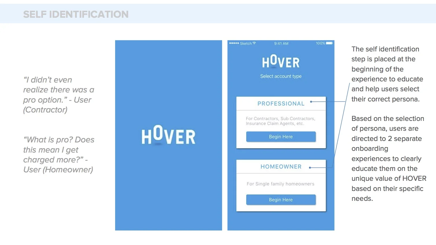
- Move self-identification step to the beginning of the experience, and clearly educate users of their user group.
- Allow users to change account types if they pick wrong user group.
- Add banner notifications throughout capture analysis to notify users of progress.
Goals:
- Increase user retention after signup and download.
- Increase user self-identification metrics.
- Increase metrics of users completing the property capture process.
My Role:
As a member of an eight designer team, I was involved in all stages of the onboarding redesign including conducting user interviews, hi-fi and lo-fi experience design, and hi-fi visual design on iOS and Android. Specifically during the research phase, I conducted phone interviews of existing users around the country and I ran comprehension testing of the existing application, performing usability tests of our redesigns. I was an integral part of creating lo-fidelity mockups and wireframes and streamlining the signup process. I also redesigned the "My Properties" page on iOS and Android.
Our Design Process:
Our clients from Hover had clear goals that they wanted to have accomplished by our redesigns, and they also offered us plenty of existing users to interview. This allowed us to jump directly into a research phase which set the foundation for our onboarding redesign. It became clear from the beginning that separating the two main user types (Homeowners and Professionals) would allow us to focus on specific pain points for each user group and tailor our designs for those specific users. During this phase we were able to define the true end of the onboarding process, which gave us a clear understanding of the end point to our project. In our case, onboarding ended when the user captures their first property.
Findings in the research phase allowed us to create personas, synthesize pain points, and lead us into our lo-fidelity stage. We were able to validate our lo-fidelity prototypes through user testing via Marvel App to gather more data to strengthen our case for the redesign. We used this information to lead us to a high-fidelity phase which was also extensively validated.
Research Phase:
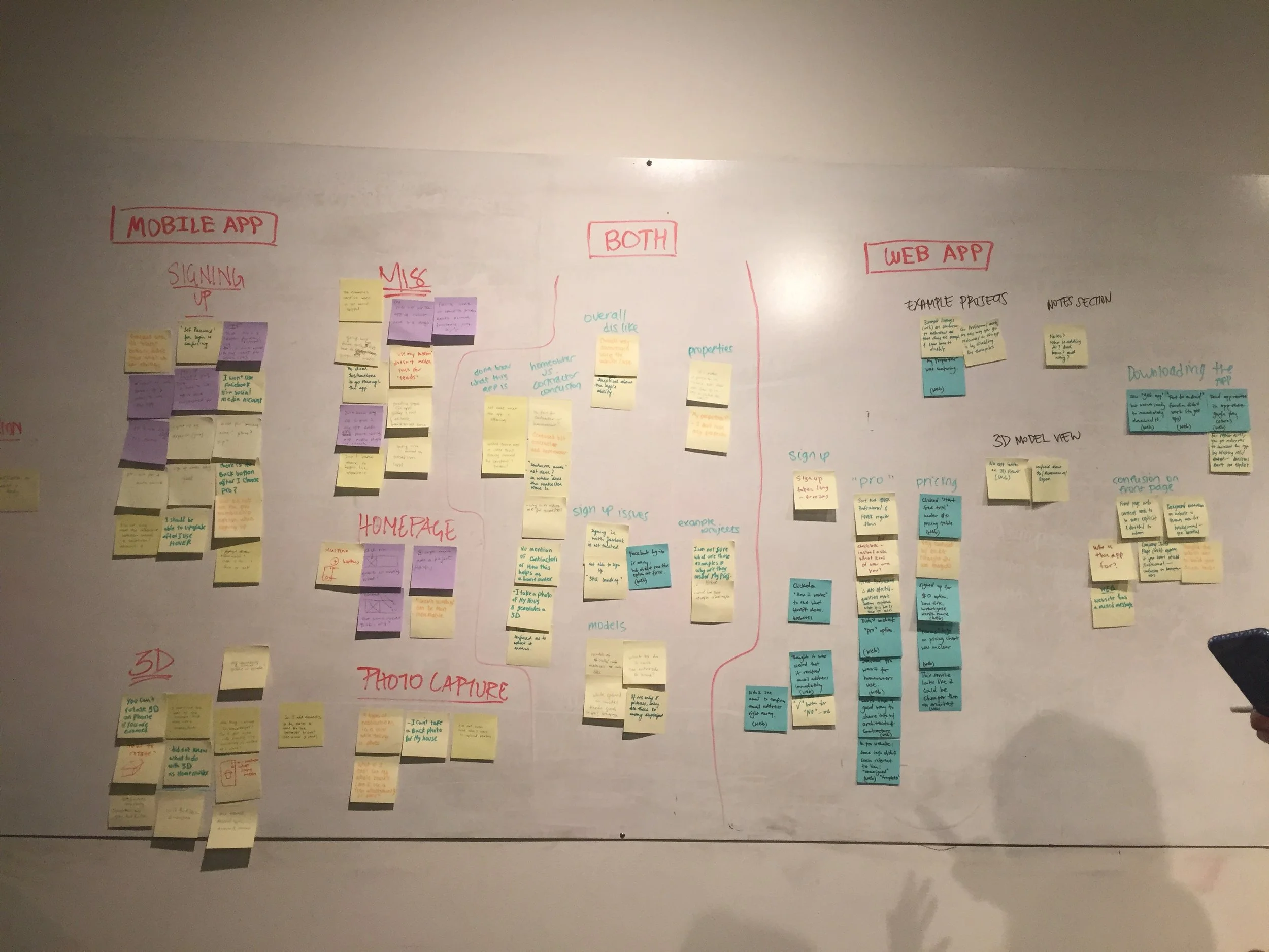
Having a client who provided plenty of users to interview, and who was willing to fund Amazon gift cards to help secure our interviews, meant that we had the opportunity to interview a lot of users and gain valuable knowledge to base our designs off of. After two weeks of user interviews, both homeowners, and professionals, we gathered all of our data in a data synthesizing workshop. We wrote every pain point discussed from every interview on Post-it notes, separating them by Mobile and Web. By visually grouping pain points on the wall, it was easy to tell the primary issues our users had, and therefore, where we should focus most of our efforts.
Primary Findings Throughout Research Phase:
- Two primary user groups use Hover, and they have vastly different expectations of the product and uses of the product.
- Homeowners used the app to visualize customizations and share those customizations with contractors.
- Professionals used the app only for its measuring capabilities to speed and cheapen the estimation process.
- Self-identification was difficult because the onboarding process unclearly categorized the two user groups.
- Neither user group knew what Hover Pro was, or how that related to them.
- Users were unclear over both why they should use Hover and how to use Hover, leading to a steep user drop-off after downloading the app.
- Users did not know how to start the process of getting their 3D Model or how long it took to get this model.
Above: Converging ideas in a data synthesis workshop.
Pain Points:
Users expressed that they were confused throughout most of their initial experience with the product. Once they figured out Hover's value, and how to use the app, users tended to come back for more. However, the vast majority of potential users gave up shortly after signup due to a few reoccurring pain points. Users' confusion was compounded by the fact that most of are contracting professionals between the ages of 35-55, without a ton of computer literacy.
- Signup/Self-Selection: Professional vs. Homeowner
- Users do not understand how they fit into the two categories.
- Users do not understand what they will get by selecting a certain category.
- Value Education: What exactly does Hover provide?
- Pricing Options: How much does Hover actually cost?
- Does pricing differ between user types?
- Are costs recurring?
- Instructions Eduction: How to use the photo capture, 3D manipulation, "toolbox" features.
- Progress of Analysis: Users were unable to track the progress of property analysis, and are not notified when 3D renderings and measurements are available.
Actions:
- Move self-selection process to the beginning of onboarding flow and explain account types clearly.
- Immediately show the value proposition based on self-identified user group.
- Homeowners were immediately shown customization features, while technical features such as the HOVER’s speed, accuracy, and exportable measurement reports were shown to professionals.
- Create an in-app tutorial to walk users through capturing process.
- Implement notification features.
Goals
- Value: Clearly express the purpose and value of Hover.
- Simplicity: Simplify and clarify the signup process to allow users to correctly self-identify, tailoring Hover’s primary functionalities to their specific user group.
- Clarity: Clearly and rapidly show the users how to use the app and capture a home.
- Notify users when the app is working and when a home has been analyzed.
Task Flows:
After deciding on our goals and actions, we split off into teams to create multiple task flows to see how we could best solve the issues at hand. By splitting into teams to reach the same goal, we were able to test many different options and later vote on the task flow that worked the best. This exercise is just one example of how our team successfully diverged and then converged our ideas to quickly come up with a successful option.
Lo-Fidelity Phase:
Self Identification: Improved success rate of self identification by bringing it upfront and separating the flows based on personas
Capturing a property: By bringing the action buttons (view 3D model and measurement report) to homepage and the initial value education (tutorial), users were more likely to capture a property
Switching between accounts: During sign up, option to re-evaluate self identification and switch accounts were needed to be added
Notifications: Reminders / notifications outside app were needed and added to improve metrics of capture rate>
Above: Lo-Fidelity Prototype for compreshension and usability testing.
Above: Lo-Fidelity Prototype for usability testing.
Hi-Fidelity Phase:
With so much emphasis put on our Research and Lo-Fidelity phases, our Hi-Fidelity phase was simple, quick, and focused. We transitioned our wireframes into Hi-Fidelity mockups in Sketch, and tested our prototypes with real users using Marvel. I was in charge of designing the Property Detail page.
Hi-Fi Redesigns:
Self Identification:
Sign Up Flow:
Value Education:
Tutorial:
Home Page (My Properties):
Property Detail:
Notifications:
Validation:
Our Hi-Fidelity prototypes were validated, and we were able to confidently deliver these redesigns to our client.
Check out the clickable prototype below if you want a little taste of how our redesign works.


